Graph you Data and Email It
By Rayed
I have a new website and I want to know the number of new signup every day, so I wrote a small script new_users.sh that will print the number of new signups today.
$ new_users.sh 280
I ran this script daily using a cron job and add it to user.dat file:
0 0 * * * /home/rayed/bin/new_users.sh >> /home/rayed/var/user.dat
After few days the file will look like this:
#Users
50
104
202
298
290
289
291
310
311
280
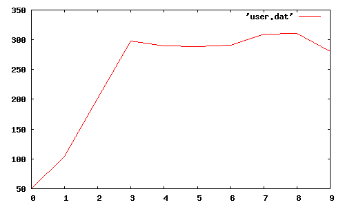
I could send this file daily and read, but it wouldn’t give a good picture of how new user signup is changing by time, so the next logical step is to convert it to a graph for easier understanding.
I used gnuplot to convert the textual data to a graph, and automatically email it to me.
So I wrote the following small script, email_graph.sh:
#!/bin/sh

PATH="/usr/local/sbin:/usr/local/bin:/usr/sbin:/usr/bin:/sbin:/bin"

from_email="rayed@example.com"
to_email="rayed@example.com"

plot="
set terminal png \
    medium \
    size 800,400;
plot  'user.dat' with lines;
"

img_base64=`echo $plot | gnuplot | base64`

sendmail $to_email <<EOF
From: <$from_email>
To: <$to_email>
Subject: Plot and Inline image from CLI
Mime-Version: 1.0
Content-Type: multipart/related; boundary="boundary-example"; type="text/html"

--boundary-example
Content-Type: text/html; charset="US-ASCII"

This email sent from Linux CLI:
<br>
<IMG SRC="cid:plot_image_1" ALT="Plot">

--boundary-example
Content-ID: <plot_image_1>
Content-Type: IMAGE/PNG
Content-Transfer-Encoding: BASE64

$img_base64

--boundary-example--
EOF
When you run it you will receive the following graph on your email:

Of course you can edit the email HTML template, add new graph, or do whatever you like to customise it.
I hope you find it useful.
Side note to self:
To install gnuplot with X11 support on OSX:
brew install gnuplot --with-x